Version: 2-11-2023
1. Exploring the evolution of process mapping: From Ancient Hieroglyphs to digital Workflows
2. Defining the phenomenon “Process”: Understanding the key Concepts and importance
Processes are the lifeblood of any organization, governing how tasks are executed, products are manufactured, services are delivered, and goals are achieved. While the term “process” may seem straightforward, its significance and complexity extend far beyond its basic definition. In this article, we will delve into the concept of a process, its fundamental components, and why understanding and optimizing processes are critical for the success of businesses and various other endeavors.
Defining a Process
A process can be defined as a series of interconnected steps or activities that, when executed in a specific sequence, transform inputs into outputs or achieve a particular goal. Processes can range from simple, everyday tasks, such as making coffee, to complex, multifaceted procedures, like manufacturing an automobile.
Key Components of a Process
- Inputs: Processes begin with inputs, which are the resources, materials, information, or data required to initiate the process. Inputs are the starting point and often set the stage for the subsequent steps.
- Activities or Steps: The core of any process consists of a set of activities or steps that transform inputs into desired outputs. These activities are typically performed by individuals, teams, or machines and are carried out in a specific order or sequence.
- Outputs: Outputs represent the end result or product of a process. They can take various forms, such as physical goods, services, reports, or data. Outputs are what the process aims to achieve.
- Resources: Processes require various resources, including human resources (employees), equipment, tools, information technology, and time. Efficient allocation and utilization of these resources are crucial for successful process execution.
- Controls and Metrics: To ensure that processes are effective and meet their objectives, controls and metrics are often implemented. Controls include rules, guidelines, and quality checks, while metrics measure the performance and outcomes of the process.
A process is a series of transformations during transit, as a result of which the element entered changes place, position, shape, dimension function, property or any other characteristic
Why Processes Matter
- Efficiency and Consistency: Well-defined processes help organizations perform tasks efficiently and consistently. They minimize errors and variations in output, leading to higher quality and reliability.
- Transparency: Processes provide transparency and visibility into how work is performed. This transparency is essential for accountability and troubleshooting.
- Scalability: As organizations grow, having standardized processes in place allows for easier scaling of operations. New employees can quickly understand and follow established procedures.
- Continuous Improvement: By analyzing and optimizing processes, organizations can identify areas for improvement and innovation. Continuous improvement methodologies, such as Six Sigma and Lean, rely on process analysis to drive change.
- Compliance and Risk Management: In highly regulated industries, processes ensure that organizations comply with legal and industry-specific standards. They also help identify and mitigate risks.
- Customer Satisfaction: Efficient processes often result in faster response times and better customer service. Satisfied customers are more likely to return and recommend a business to others.
Processes are the building blocks of organizational success. Understanding and effectively managing processes are essential for achieving efficiency, consistency, and innovation. Whether you’re running a business, managing a project, or pursuing personal goals, a clear grasp of processes and their optimization can lead to better outcomes and increased satisfaction for all stakeholders involved. In a world that continually evolves, mastering the art of process management remains a cornerstone of success.
3. Explaining Process Mapping
Process mapping is a powerful visual tool used in various fields, including business, project management, healthcare, and manufacturing, to represent and analyze workflows, procedures, and processes. It involves creating a graphical representation of a process, typically using symbols and diagrams, to provide a clear and detailed view of how a series of steps or activities are carried out to achieve a specific goal or outcome. The primary purpose of process mapping is to improve understanding, communication, analysis, and optimization of processes. Here’s a more detailed explanation of process mapping:
- Visual Representation: Process mapping uses graphical elements, symbols, and flowcharts to represent a process. These visual representations make it easier for individuals to understand the process at a glance, regardless of their level of expertise or background.
- Clarity and Transparency: By breaking down a process into its constituent steps and visually illustrating each step’s relationship and sequence, process mapping brings clarity and transparency to the process. This transparency is essential for identifying bottlenecks, inefficiencies, and areas for improvement.
- Standardization: Process maps establish a standardized way of performing tasks or processes within an organization. This standardization helps ensure consistency, reduces errors, and facilitates training of new employees.
- Identification of Roles and Responsibilities: Process maps often include information about who is responsible for each step or activity within the process. This clarifies roles and responsibilities, which is crucial for accountability and teamwork.
- Data Collection and Analysis: Process mapping can be used to gather data about the process, such as cycle times, input and output variables, and quality control points. This data can then be analyzed to identify trends, performance metrics, and areas for improvement.
- Process Optimization: After creating a process map and analyzing it, organizations can identify opportunities for streamlining, eliminating unnecessary steps, reducing costs, and enhancing efficiency. This optimization can lead to improved productivity and customer satisfaction.
- Problem Solving: Process maps are valuable tools for problem-solving and root cause analysis. When issues or bottlenecks occur in a process, teams can refer to the map to pinpoint the source of the problem and develop solutions.
- Continuous Improvement: Many organizations use process mapping as part of their continuous improvement efforts. It allows them to regularly review and update processes to adapt to changing needs and industry standards.
- Communication: Process maps are effective communication tools, particularly when multiple stakeholders are involved in a process. They provide a common language and visual reference point for discussing and understanding how a process works.
- Documentation: Process maps serve as documentation of how a process operates. They can be valuable references for audits, compliance, and training purposes.
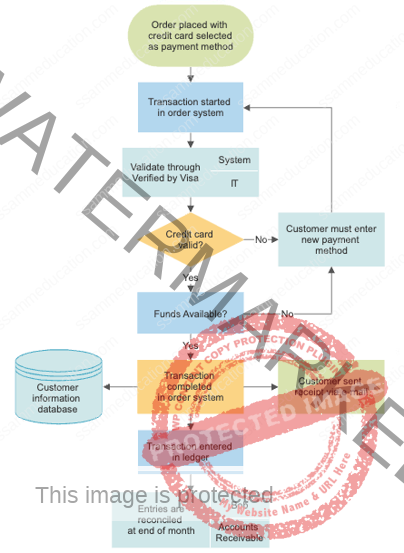
Common symbols and notations are used in process mapping, such as rectangles for processes or activities, arrows to indicate flow, diamonds for decision points, and ovals for start and end points. Software tools and dedicated process mapping software make it easier to create, edit, and share process maps digitally.
In summary, process mapping is a versatile and essential technique for analyzing, optimizing, and documenting processes within organizations. It enhances understanding, transparency, and collaboration, ultimately leading to improved efficiency, quality, and outcomes.
4. Types of Process mapping
Types of Flowcharts:
- Process Flowchart: This type of flowchart focuses on illustrating the sequential steps and actions within a specific process. It provides a detailed overview of how a process is executed from start to finish.
- Decision Flowchart: Decision flowcharts emphasize decision points within a process. They use diamond-shaped symbols to represent choices or decision points and provide different paths depending on the outcomes of those decisions.
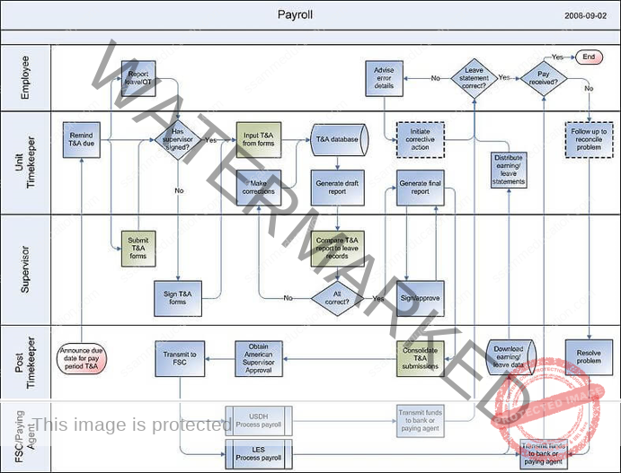
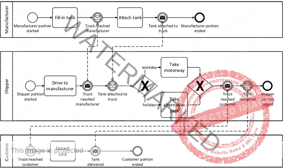
- Swimlane Flowchart: Swimlane flowcharts are particularly useful when multiple individuals or departments are involved in a process. Each “swimlane” represents a specific role or department, and the flowchart shows how tasks move between these lanes, helping to clarify responsibilities and handoffs.
- Data Flow Diagram (DFD): While not a traditional flowchart, DFDs focus on the flow of data within a system or process. They use circles to represent processes, arrows to represent data flows, and data stores to represent data storage points.
4.2 Value Stream Mapping (VSM)
Key Elements of Value Stream Mapping:
- Value-Added and Non-Value-Added Activities: VSM distinguishes between value-added activities (those that directly contribute to meeting customer needs) and non-value-added activities (those that do not add value and often introduce waste). Identifying and minimizing non-value-added activities is a central focus of VSM.
- Current State Map: The first step in VSM is to create a Current State Map, which visually represents the existing processes, steps, and activities within the value stream. This map includes information on cycle times, lead times, inventory levels, and other relevant metrics. It highlights areas of waste, such as waiting times, overproduction, and unnecessary transportation.
- Future State Map: After analyzing the Current State Map, the goal is to design a more efficient Future State Map that eliminates or reduces waste and improves overall value stream performance. This may involve changes in process design, resource allocation, and workflow.
- Value-Stream Metrics: VSM typically involves the collection and analysis of key metrics, such as cycle time, lead time, takt time (customer demand rate), and first-time quality. These metrics help in quantifying the performance of the value stream and tracking improvements over time.
- Process Steps: Each process step is represented as a box or symbol on the map, indicating what is done, where it is done, and who is responsible. This includes manufacturing processes, administrative tasks, and information flows.
- Inventory Levels: Inventory levels at various stages of the value stream are shown on the map to highlight areas where excess inventory is being held, as excessive inventory is a form of waste.
- Information Flow: VSM includes the flow of information and communication between different parts of the value stream. This can include order processing, data sharing, and communication with suppliers and customers.
Benefits of Value Stream Mapping:
- Waste Reduction: VSM helps identify and eliminate various forms of waste, such as overproduction, waiting, excess inventory, and unnecessary transportation.
- Improved Efficiency: By optimizing processes and reducing non-value-added activities, VSM leads to improved overall efficiency and reduced lead times.
- Enhanced Customer Value: Streamlining the value stream results in quicker response times to customer demands and higher quality products or services.
- Cost Reduction: VSM often leads to cost savings through reduced inventory, decreased rework, and improved resource allocation.
- Visual Communication: It provides a visual representation of the value stream, making it easier for team members to understand and collaborate on improvement efforts.
- Continuous Improvement: VSM is part of a continuous improvement cycle, and organizations often revisit and update their value stream maps as they make progress toward their future state goals.
Overall, Value Stream Mapping is a powerful tool for organizations committed to Lean principles and continuous improvement. It helps them streamline processes, reduce waste, and ultimately deliver more value to their customers.
4.3 Swimlane Mapping
Swimlane mapping, also known as swimlane diagrams or swimlane charts, is a visual representation technique used to depict and clarify the flow of work, tasks, or processes within a complex system or organization. This method is particularly useful when multiple individuals, teams, or departments are involved in a process, and it aims to provide clarity about who is responsible for each task or step. Swimlane mapping is characterized by the use of “swimlanes,” which are distinct horizontal or vertical lanes that represent different entities or roles within the process. Here’s a description of swimlane mapping:
Purpose: Swimlane mapping is used to clearly define the roles and responsibilities of various individuals, departments, or teams within a process. It helps to show who is responsible for each step.
Structure: In swimlane maps, each swimlane (horizontal or vertical) represents a specific department, role, or individual involved in the process.
Pros:
- Clearly defines roles and responsibilities.
- Facilitates understanding of handoffs between departments or individuals.
- Suitable for cross-functional processes.
Cons:
- Can become complex for processes involving many participants.
- May not provide a holistic view of the entire process.
Key Components of Swimlane Mapping:
- Swimlanes: Swimlanes are the horizontal or vertical divisions on the map, each of which represents a specific entity, team, department, role, or participant in the process. These lanes are usually labeled to indicate who or what is responsible for the tasks within that lane.
- Process Steps: Within each swimlane, the process steps or tasks are depicted using standard flowchart symbols, such as rectangles for activities, diamonds for decisions, ovals for start/end points, and arrows to connect and show the flow of tasks.
- Task Ownership: Swimlanes make it clear which entity or role is responsible for performing each task or step in the process. This helps prevent confusion and ensures accountability.
- Sequential Flow: Swimlane diagrams show the sequence of tasks as they move from one swimlane to another. Arrows or lines connecting the tasks indicate the direction of flow, demonstrating how work progresses through the various entities or roles.
- Decisions and Branches: Decision points in the process are represented by diamond-shaped symbols within the appropriate swimlane. These decision points indicate where different choices or paths can be taken.
Benefits of Swimlane Mapping:
- Clarity: Swimlane diagrams provide a clear and visual representation of complex processes, making it easier for individuals to understand who does what and how tasks flow through the system.
- Accountability: By assigning specific swimlanes to entities or roles, swimlane mapping clarifies responsibility for each task, reducing the likelihood of tasks falling through the cracks.
- Process Improvement: Identifying bottlenecks, handoffs, and inefficiencies becomes more apparent in swimlane diagrams, facilitating process improvement initiatives.
- Collaboration: Swimlane mapping encourages collaboration and communication between different departments or teams involved in the process, as it helps them see how their tasks relate to others.
- Documentation: Swimlane diagrams serve as valuable documentation tools, preserving knowledge about processes and their ownership.
- Problem Solving: When issues arise in a process, swimlane diagrams can aid in pinpointing where the breakdown occurred and who is responsible.
- Standardization: Organizations can use swimlane mapping to standardize processes by clearly defining roles and responsibilities.
Swimlane mapping is a versatile tool that can be applied in various industries and settings, including project management, business process analysis, software development, and healthcare, to improve coordination, transparency, and efficiency within complex processes involving multiple stakeholders.
4.4. SIPOC Mapping
SIPOC mapping is a visual and structured tool used in process improvement and business analysis to define and understand the scope and boundaries of a process. The acronym SIPOC stands for Suppliers, Inputs, Process, Outputs, and Customers. A SIPOC map provides a high-level overview of a process, highlighting its key components and relationships. Here’s a description of SIPOC mapping:
Components of a SIPOC Map:
- Suppliers: Suppliers are the entities or sources that provide the inputs or resources needed for the process to function. These can be internal or external to the organization. In the SIPOC map, the suppliers are listed at the beginning of the diagram.
- Inputs: Inputs represent the materials, information, or resources that are received from suppliers and are used as the raw materials or starting point for the process. Inputs can include data, materials, instructions, and more. Inputs are listed after the suppliers in the SIPOC map.
- Process: The process itself is the central part of the SIPOC map. It outlines the series of steps or activities that transform the inputs into outputs. Process steps are typically represented in a simplified manner, often as high-level boxes or shapes, without detailing every substep.
- Outputs: Outputs are the end results or products generated by the process. These can be physical products, services, reports, or any other deliverables that are produced as a result of the process. Outputs follow the process in the SIPOC map.
- Customers: Customers are the recipients or users of the outputs produced by the process. They can be internal or external to the organization and may have specific requirements or expectations for the outputs. Customers are listed at the end of the SIPOC map.
Benefits of SIPOC Mapping
- Clarity: SIPOC maps provide a clear and concise visual representation of the process, making it easy to understand its key components and relationships.
- Scope Definition: SIPOC helps define the boundaries of the process, including its starting and ending points. This is essential for ensuring a common understanding of the process’s scope.
- Identifying Stakeholders: By identifying suppliers and customers, SIPOC mapping helps in recognizing key stakeholders who have a role or interest in the process.
- Focus on Customer Needs: SIPOC encourages organizations to consider the needs and expectations of customers, aligning the process with customer requirements.
- Process Improvement: It serves as a valuable starting point for process improvement efforts by highlighting areas where enhancements or changes may be needed.
- Communication: SIPOC maps are useful communication tools, helping teams and stakeholders quickly grasp the essentials of a process.
- Documentation: They provide a documented overview of the process, which can be referenced for training, audits, or knowledge sharing.
SIPOC mapping is often used as a preliminary step in process improvement methodologies like Six Sigma and Lean, where a clear understanding of the current state of a process is crucial before making improvements. It can also be revisited and updated as processes evolve or change over time.
4.5. Business Process Model and Notation (BPMN)
Business Process Model and Notation (BPMN) is a standardized graphical notation used for modeling and documenting business processes and workflows. BPMN provides a common language that allows organizations to visually represent their processes in a clear and consistent manner. It is widely used in business process management (BPM) and process automation initiatives. Here’s an overview of BPMN:
Key Elements of BPMN:
- Flow Objects:
- Activities: Represent tasks or work that needs to be performed as part of the process. Activities can be further categorized as tasks and subprocesses.
- Events: Depict points in the process where something happens or triggers a response. Events can be classified as start events (indicating the beginning of a process), intermediate events (occurring during the process), and end events (marking the conclusion of a process).
- Gateways: Represent decision points in the process flow, indicating where the flow can branch or converge based on conditions. Gateways include exclusive, inclusive, parallel, and event-based gateways.
- Connecting Objects:
- Sequence Flow: Arrows connecting flow objects to show the order in which activities are executed.
- Message Flow: Represent the flow of messages or information between different participants or processes.
- Association: Dotted lines with arrows that connect text annotations or data objects to elements in the diagram for additional information.
- Swimlanes:
- Swimlanes are used to group and organize activities within a process diagram based on roles, departments, or participants. They provide clarity about who is responsible for executing each task.
- Artifacts:
- Data Objects: Represent data or information used or generated by the process. They can be associated with activities to show data dependencies.
- Text Annotations: Provide additional information or descriptions to clarify elements within the diagram.
Benefits of BPMN:
- Standardization: BPMN is an internationally recognized standard, ensuring that process diagrams are easily understood and consistent across organizations and industries.
- Clarity: BPMN diagrams are highly visual and intuitive, making it easier for stakeholders to understand and discuss business processes.
- Communication: BPMN facilitates clear communication between business and technical teams, as well as between different departments and stakeholders.
- Process Improvement: It supports process analysis and optimization efforts by providing a detailed view of how processes work.
- Process Automation: BPMN diagrams can be used as a basis for automating processes using BPM software, ensuring that workflows are accurately implemented in software systems.
- Documentation: BPMN diagrams serve as valuable documentation tools for capturing and preserving knowledge about business processes.
BPMN is a flexible notation that can be adapted for various levels of detail, from high-level overviews of entire business processes to detailed process maps with precise execution instructions. It is commonly used in conjunction with BPM software and workflow automation tools to design, implement, and monitor business processes.
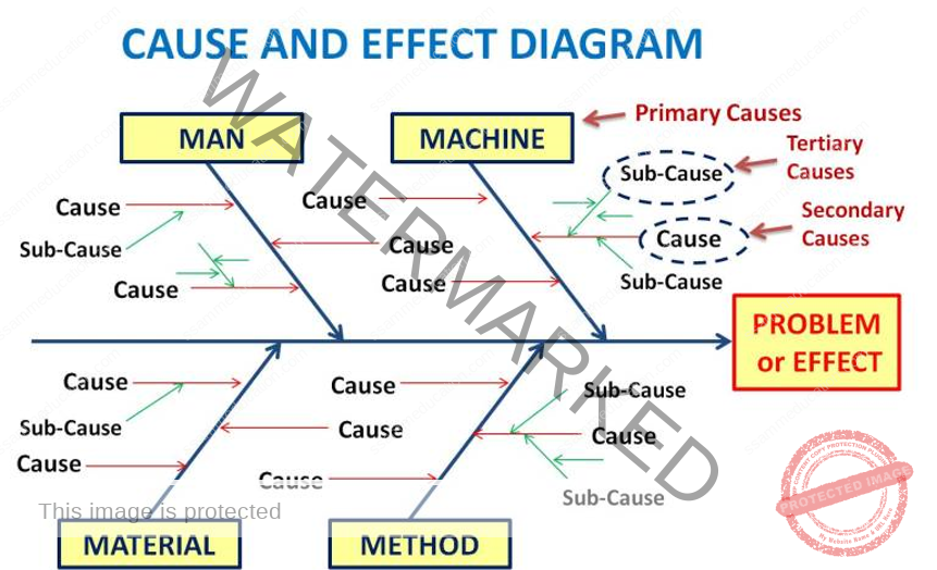
Key Elements of a Fishbone Diagram:
- Problem Statement: At the “head” of the diagram, you write a clear and concise problem statement or the issue you want to investigate. This problem statement serves as the central focus of the analysis.
- Spine: The main horizontal line extending from the problem statement represents the “spine” of the fishbone.
- Bones (Categories): Extending diagonally from the spine are several lines, often referred to as “bones.” These lines represent different categories or major factors that could potentially contribute to the problem. Common categories include:
- People: Factors related to individuals involved in the process.
- Process: Factors related to the steps and procedures in the process.
- Equipment: Factors related to machinery, tools, or technology used in the process.
- Materials: Factors related to raw materials, supplies, or inputs.
- Environment: Factors related to external conditions or the work environment.
- Measurement: Factors related to measurement, data, or metrics.
- Sub-Bones: Beneath each major category, you can add sub-bones or smaller branches to represent more specific factors or causes within that category. These sub-bones help break down the analysis into finer levels of detail.
- Cause Analysis: Along each bone and sub-bone, you list potential causes or factors that may contribute to the problem. These causes can be identified through brainstorming sessions, data analysis, or the input of relevant stakeholders.
- Arrows: Arrows connect the causes or factors to the appropriate bone or sub-bone, indicating their relationships. This helps visually link the causes to their respective categories.
Benefits of Fishbone Diagrams:
- Structured Analysis: Fishbone Diagrams provide a structured and systematic approach to problem analysis by categorizing potential causes.
- Visual Representation: They offer a visual and easy-to-understand representation of complex problem scenarios, making it easier for teams to identify and communicate potential causes.
- Collaboration: Fishbone Diagrams encourage team collaboration and brainstorming sessions, involving various stakeholders in problem-solving.
- Root Cause Identification: They help identify the root causes of a problem, allowing organizations to address issues at their source rather than treating symptoms.
- Prioritization: By visualizing causes, teams can prioritize which factors to investigate further or address first.
- Continuous Improvement: Fishbone Diagrams support continuous improvement efforts by facilitating ongoing problem analysis and solutions.
Fishbone Diagrams are valuable tools in quality improvement initiatives, root cause analysis, and process optimization. They guide teams in systematically exploring potential causes and developing effective solutions to address identified issues.
4.8. Gantt Chart Mapping
A Gantt chart is a visual project management tool used to plan, schedule, and track tasks and activities over time. It provides a graphical representation of a project’s timeline, showing the start and end dates of various tasks, their dependencies, and their progress. Gantt charts are named after Henry L. Gantt, who developed this project management technique in the early 20th century. Here’s a description of Gantt chart mapping:
Key Elements of a Gantt Chart:
- Tasks or Activities: Each task or activity in a project is represented as a separate bar or block on the Gantt chart. These blocks are often arranged in rows or columns, depending on the layout of the chart.
- Time Scale: The horizontal axis of the Gantt chart represents time, typically displayed in days, weeks, or months. It shows the project’s timeline from the project start date to the end date.
- Task Duration: The length of each task bar corresponds to the estimated or actual duration of the task. This duration is usually represented in units of time (e.g., days or weeks).
- Dependencies: Gantt charts can depict task dependencies, showing which tasks must be completed before others can start. Arrows or lines connecting task bars indicate these dependencies.
- Milestones: Milestones are significant events or achievements within the project. They are usually represented as diamond-shaped symbols along the timeline and help mark key project milestones.
- Progress Tracking: Gantt charts often include a way to track the progress of tasks. This can be done by shading or coloring completed portions of task bars or using a separate progress bar alongside the task.
Benefits of Gantt Charts:
- Visualization: Gantt charts provide a clear and visual representation of project tasks and their timelines, making it easy for project managers and team members to understand project schedules.
- Task Dependencies: They help identify and manage task dependencies, ensuring that tasks are completed in the correct sequence.
- Resource Allocation: Gantt charts assist in allocating resources effectively by showing when specific resources are needed for each task.
- Time Management: They aid in time management by allowing project managers to allocate appropriate time for each task and track progress against planned schedules.
- Communication: Gantt charts are useful communication tools for sharing project timelines and progress with stakeholders, team members, and clients.
- Risk Identification: By visualizing the project timeline, Gantt charts can help project managers identify potential delays or bottlenecks and take proactive measures to mitigate risks.
- Project Tracking: Gantt charts allow for real-time tracking of project progress. When updated regularly, they provide a clear picture of where the project stands in relation to the planned schedule.
Gantt charts are widely used in various industries, including construction, engineering, software development, and event planning. They are effective tools for managing and controlling projects, ensuring that tasks are completed on time and within budget. Modern project management software often includes Gantt chart features that make it easier to create, update, and share project schedules.
Key Elements of a Timeline Map:
- Time Axis: The horizontal axis of the timeline map represents time, with a starting point (usually the past) on the left and an ending point (usually the future) on the right. The axis is divided into increments, such as years, months, weeks, or days, depending on the scale of the timeline.
- Events or Data Points: Events, data points, or milestones are represented as markers or icons along the timeline axis. Each marker corresponds to a specific point in time and can be labeled with relevant information.
- Connectivity: Timeline maps may include lines or arrows connecting related events or data points. These connections help illustrate dependencies, sequences, or relationships between events.
- Annotations: Annotations, descriptions, or labels are often added to the timeline to provide context and details about the events or data points. Annotations may include additional information, explanations, or references.
Types of Timeline Maps:
- Linear Timeline: A linear timeline map is the most common type, where events are displayed sequentially along a single timeline axis. It is used to illustrate a straightforward chronological sequence of events.
- Interactive Timeline: Interactive timeline maps often incorporate digital features that allow users to explore events in more detail. Users can click on events to access additional information or navigate through time.
- Comparative Timeline: Comparative timeline maps show multiple timelines side by side or overlapping to compare events or developments across different categories, locations, or entities.
- Project Timeline: Project timelines are used in project management to display the schedule of tasks and milestones for a specific project. They often include task dependencies, durations, and responsible parties.
- Historical Timeline: Historical timeline maps provide an overview of historical events, such as wars, inventions, political movements, or cultural developments, in a chronological order.
Benefits of Timeline Mapping:
- Visualization: Timeline maps provide a visual representation of temporal data, making it easier to comprehend complex sequences and relationships.
- Historical Context: They help viewers understand the historical context of events, especially when presented in a chronological order.
- Project Management: In project management, timeline maps are essential for tracking project schedules, milestones, and task dependencies.
- Education: Timeline maps are valuable tools for educational purposes, helping students and learners grasp the chronological flow of historical or scientific events.
- Data Analysis: Timeline mapping can be used for analyzing time-based data trends, patterns, and correlations.
- Communication: Timeline maps are effective communication tools for conveying timelines, schedules, and historical narratives to a wide audience.
Timeline mapping can be done manually using paper and markers or digitally using various software tools and applications, depending on the complexity and scale of the project. It is a versatile technique used across many fields, from history and education to project management and data analysis.
4.10 Customer Journey Mapping
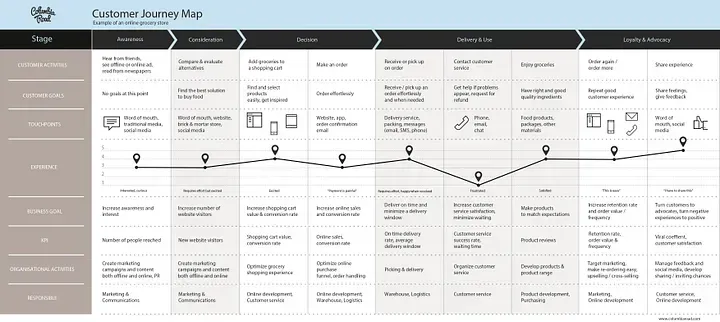
Customer Journey Mapping (CJM) is a strategic tool used by businesses and organizations to visualize and understand the experiences of their customers as they interact with products, services, or processes. It involves creating a visual representation or map of the customer’s journey from the initial touchpoint to the final interaction, highlighting key touchpoints, emotions, and pain points along the way. Here’s a description of customer journey mapping:
Key Elements of Customer Journey Mapping:
- Customer Persona: Before creating a customer journey map, it’s essential to develop detailed customer personas that represent different segments of your target audience. These personas include demographic information, preferences, needs, and pain points.
- Touchpoints: Customer journey maps identify and document all the touchpoints where customers interact with your organization. Touchpoints can include website visits, social media interactions, phone calls, emails, in-store visits, and more.
- Stages: The customer journey is typically divided into different stages, such as Awareness, Consideration, Purchase, Usage, and Loyalty. The number and names of stages can vary depending on the specific context of your business.
- Emotions and Actions: Along the customer journey, emotions, actions, and motivations are documented to understand how customers feel and what they do at each touchpoint. This helps in identifying moments of delight or frustration.
- Pain Points: Customer journey maps highlight pain points or challenges that customers encounter during their interactions. These can include slow response times, confusing interfaces, or unmet expectations.
- Opportunities: In addition to identifying pain points, CJMs also highlight opportunities for improvement and areas where organizations can enhance the customer experience. These can include personalized recommendations, proactive support, or streamlined processes.
- Channels: Customer journey maps specify the channels or communication methods used at each touchpoint, whether it’s a website, email, phone call, social media, or face-to-face interaction.
Benefits of Customer Journey Mapping:
- Customer-Centric Focus: CJMs shift the organization’s perspective to a customer-centric one, emphasizing the customer’s experience at every touchpoint.
- Alignment: They help align various departments within an organization to work together toward a common goal: delivering a seamless and satisfying customer experience.
- Identification of Pain Points: CJMs reveal pain points in the customer journey, allowing organizations to prioritize improvements that can lead to higher customer satisfaction and retention.
- Opportunity Identification: They uncover opportunities to enhance the customer experience, whether through technology, personalization, or improved processes.
- Innovation: CJMs encourage innovative thinking by highlighting areas where organizations can stand out from competitors and exceed customer expectations.
- Communication: CJMs provide a clear and visual tool for communicating insights about the customer journey to stakeholders across the organization.
Creating a customer journey map involves research, including customer interviews, surveys, and data analysis, to ensure that the map accurately reflects the customer’s perspective. The goal is to use the insights gained from the mapping process to improve the overall customer experience and drive business growth. Customer journey mapping is an ongoing process, as customer behaviors and expectations can change over time, requiring continuous updates and adjustments to the map.
4.11 Wrap-Up
5. SIPOC: Deepening the subject
SIPOC is a process mapping technique that stands for “Suppliers, Inputs, Process, Outputs, Customers.” It is a high-level visual representation used to provide a macroscopic view of a process, particularly in the context of business and quality management. SIPOC mapping helps organizations understand the key elements of a process, identify stakeholders, and highlight the flow of materials, information, and actions through a process. Here’s a detailed explanation of SIPOC process mapping:
Suppliers (S): In the SIPOC diagram, “Suppliers” represent the entities or sources that provide the necessary inputs to initiate the process. These can be internal or external to the organization. Suppliers can be individuals, departments, other processes, or even external vendors.
- Example: In a manufacturing process, the suppliers could include raw material suppliers, machine operators, or data sources.
Inputs (I): The “Inputs” are the resources, materials, data, information, or triggers that are required for the process to start. Inputs are what the suppliers provide, and they are essential for the process to proceed.
- Example: For an order processing system, inputs might include customer orders, product specifications, pricing information, and order forms.
Process (P): The “Process” refers to the series of activities or steps that transform the inputs into the desired outputs. This is the core of the SIPOC diagram, and it outlines the sequence of actions and decision points involved in the process.
- Example: In the order processing process, activities might include order verification, inventory check, payment processing, and order fulfillment.
Outputs (O): The “Outputs” are the results, products, or services produced by the process. These are what the customers or downstream processes receive or use.
- Example: Outputs in the order processing example could be shipped products, order confirmation emails, and invoices.
Customers (C): “Customers” represent the individuals, departments, or entities that receive and benefit from the outputs of the process. Customers can be internal or external to the organization, and they are critical because their needs and satisfaction drive the process’s purpose.
- Example: Customers for the order processing process may include end-users, other departments relying on timely deliveries, or external clients.
Key Elements of a SIPOC Map:
- Suppliers: The first column of the SIPOC map identifies the suppliers, which are the entities or sources that provide the inputs needed for the process to begin. Suppliers can be internal or external to the organization and provide the raw materials, information, or resources required to initiate the process.
- Inputs: The second column lists the inputs, which are the materials, data, or information received from the suppliers. Inputs serve as the starting point for the process and are transformed or used in some way to produce the outputs.
- Process: The third column describes the process itself. It outlines the high-level steps, actions, or activities involved in transforming the inputs into outputs. The process column provides an overview of what happens within the process.
- Outputs: The fourth column specifies the outputs, which are the end results or deliverables produced by the process. Outputs can take various forms, such as products, services, reports, or completed tasks.
- Customers: The fifth column identifies the customers, who are the recipients or users of the outputs generated by the process. Customers can be internal or external to the organization and have specific requirements or expectations regarding the outputs.
Benefits of SIPOC Mapping:
- Process Understanding: SIPOC maps provide a clear and concise understanding of the scope and boundaries of a process, making it easier to communicate and comprehend.
- Stakeholder Identification: They help identify key stakeholders involved in or affected by the process, including suppliers and customers.
- Focus on Customer Needs: SIPOC maps emphasize the importance of meeting customer requirements by specifying who the customers are and what they expect from the process.
- Simplicity: SIPOC maps are simple and straightforward, making them accessible to team members and stakeholders who may not be familiar with detailed process documentation.
- Process Improvement: They serve as a starting point for process improvement efforts, allowing organizations to focus on critical process elements.
- Documentation: SIPOC maps serve as valuable documentation tools, preserving knowledge about processes and their interfaces with suppliers and customers.
Key Points to Remember about SIPOC Mapping:
- SIPOC diagrams are often created at a high level and are intended to provide an overview of a process rather than intricate details.
- They are useful for helping teams and stakeholders understand the boundaries and scope of a process.
- SIPOC mapping is an excellent tool for identifying key process stakeholders, dependencies, and interfaces.
- It can serve as a starting point for more detailed process mapping and analysis, such as flowcharting or value stream mapping.
- SIPOC maps can be instrumental in identifying opportunities for improvement and ensuring alignment with customer needs and organizational objectives.
Overall, SIPOC process mapping is a valuable tool for gaining a quick, comprehensive understanding of a process’s major components and its relationship with suppliers and customers. This can be particularly beneficial in process improvement initiatives and ensuring that processes are aligned with organizational goals and customer expectations. Also SIPOC mapping is often used in the Define phase of the DMAIC (Define, Measure, Analyze, Improve, Control) process within Six Sigma projects. It helps in defining the boundaries of the process to be improved and provides a foundation for subsequent analysis and improvement efforts. As processes evolve or change, SIPOC maps can be updated to reflect the current state of the process.
